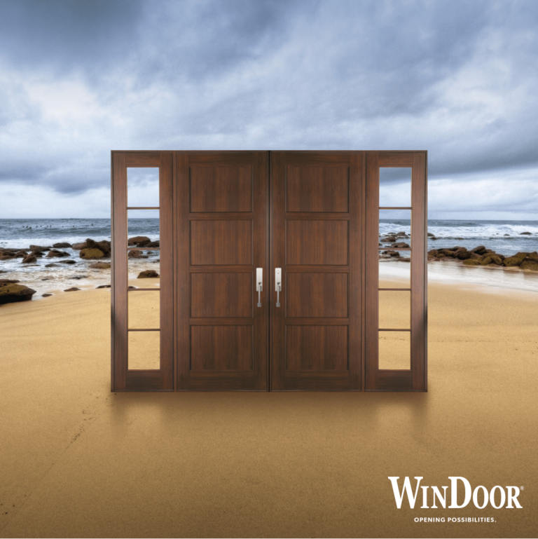


Are you inspired by the beach? So are we.
This year, bring the beach into your home with inspired color palettes that transform your indoor spaces. These trending palettes and whimsical room color combinations make home decorating easier and more satisfying. This is the perfect time to turn your house into the beach home you’ve always wanted it to be.
Related: Cabanas & Pool Houses
Nautical Navy and Crisp White

Nautical navy has long been affiliated with the coast, big ships, and life on the open sea. Balance this combination of blue and white with accent colors in gold or saffron.
Are you worried that dark blue will dominate your indoor spaces? We recommend this color scheme for a larger room, where bold colors are not just acceptable, but grounding. Use navy generously on surfaces like rugs, on the couch, and even on the walls. Remember, big rooms do well with darker colors. This room color combination works best in a room with a lot of natural light. See this color palette in action on Elle Decor.
Coral and Cool Mint
Remember the ’80s, when pastels were everywhere?
The ’80s are back, and they’re better than ever. Coral and cool mint can be both relaxing and energizing, in the right space. We recommend these colors in bedrooms and nurseries, where they’re both cheerful and soothing.
…and, while these colors are perfect for youngsters, adults can enjoy them as well, with the right planning and accessories. An example of how this color combination can work in a grown-up room like the sitting room can be found on blogs throughout the Internet.
One tip: feel free to add lots of white to your cool mint and coral spaces – these competing colors need a neutral in the background to keep the atmosphere in the room light-hearted and relaxing.
Shades of Gray, Plum, and Aqua

Moody but spirited, this room color combination reminds us of late afternoons on the coast, with storms rolling in, as the breeze becomes a wind. You get to control the moodiness of this color scheme by controlling the value of the colors. Darker values mean darker moods, lighter values make for a softer, gentler effect.
A recent article on Elle Decor explores the different effects you can achieve simply by changing the tint and value of the shade of purple. In this article, you can see the way purple can be changed to create a party-like atmosphere, or a calmer, more serious environment. This same principle applies to all three colors.
Decorating with three colors can be challenging. We recommend allowing one color to become dominant, while the other two colors serve as accent colors. Purple, gray, and green are funky colors that you might find in a dining room, living room, or bedroom. They can also be overwhelming in small spaces, so think long and hard before using these colors in the bathroom.
Seafoam Green and Refreshing Cream
Seafoam is a sweet color that brings to mind afternoons on the porch, listening to the waves roll in. Seafoam is commonly found in nurseries, but you can use this color in other rooms like the kitchen, living room, and guest room.
In rooms with lots of natural light, this color scheme can start to seem a little too bright. To keep the room grounded, feel free to throw in darker shades of green, blue, beige, or accents of bright orange.
Reinforce the “beachiness” of this color scheme by decorating the room with beach-themed items like a glass container that contains white sand, or a driftwood lamp. Of course, the effect is most obvious and notable when your floor-to-ceiling windows look out onto the beach itself.
Related: 3 Products That Make the Most of Waterfront Views
Robin’s Egg Blue and Shades of Sand

Are you drawn to beach colors that are just a little bit more bold and beautiful? Why not decorate your home with robin’s egg blue and the soft, beautiful shades of sand? See this article on Houzz that demonstrates what robin’s egg blue is really capable of.
Robin’s egg blue is a naturally darker shade of blue-green, so it looks best in rooms with generous amounts of natural light. Pull back your window treatments and enjoy the view.
In rooms with little natural light, cut back the robin’s egg blue. Use a larger proportion of cream and beige to add lightness back into the room, and feel free to use reflective surfaces like mirrors to brighten the space. An attractive pendant light hung somewhere in the room can also help create a lightness and brightness that you’ll appreciate over time.
Having a Hard Time? Tips to Choose Your Palette
Choosing a color palette can be difficult, especially if you’re not a professional interior decorator. These suggestions can help.
- Browse through pre-curated color schemes. You can find hundreds of pre-selected color schemes online. Paint companies in particular often have color schemes on their websites for homeowners who need help.
- Choose a color scheme from your favorite photo of the beach. Find a favorite photo of the beach and use one of the many online apps that allow you to select a color scheme from that photo. Some examples of apps that will do this for you include Coolers, Canva, and iColorpalette.
- Hire an expert. If you’re not comfortable putting together your own color scheme, don’t force it. Hire an interior designer to help you choose a palette that is inspired by the beach. Your interior designer can also help you choose suitable furnishings and accessories that can strengthen the connection between the room being decorated and the beach.
- Natural light makes everything more beautiful. Complement your beach-inspired color scheme with natural light from elegant windows. Sunlight makes the beach what it is, so don’t forget to let in the sunlight into your home.
Related: Inside AJO with Principal Joyce Owens
Have Fun Choosing Your Color Palette
Most people want to decorate their home in beachy colors because they love the fun and joy they feel when they’re there, so have fun with your interior decorating project. Don’t be afraid to take risks or try colors that you’ve never considered before. Remember: you can always change it later.